Telfer Stokes is a well known and influential artist who has used the artist book as a primary medium since the early 1970’s. His book work is lauded for helping to redefine the expressive potential of the book as a complete art object, specifically the codex. Besides Stokes’ construction of playful and inventive page sequence, his books are also known for text that plays with language, layers of symbolism, and the subversion of the gallery system through the “open edition” in the tradition of the multiple. Much of this work was produced in collaboration with book artist Helen Douglas, a tremendous creative talent. Below, I will compare and contrast two works by Telfer Stokes in order to explore a less appreciated aspect of the artist’s work: the importance of place and time as a context for his books.
When Telfer was born his father was already a well known painter and writer in the U.K. Telfer was raised in an “art commune” and showed an interest and a talent for painting. He attended art school and studied painting, but was still creatively unfulfilled. He didn’t want to be like the painters of his father’s generation. He wanted to break new ground and expand the creative potential of painting. In 1962 Telfer moved to New York City. Of his time there he said it was, “the most invigorating and powerful place.” He was excited by the Abstract Expressionists experiments into re-defining what painting meant. “The scale,” he observed, “the [Abstract Expressionist] painters worked on, related to the landscape and the enormity of the country.” He was so enamored with what the American painters were doing that upon his return to the U.K. Telfer attempted working on a large scale. But he was dissatisfied with the results.
As the son of a Painter/Writer, it seems only natural with hindsight, that Telfer would have an interest in textural and visual narrative. He began exploring how to use text with his paintings and in 1971 he was invited to exhibit at the Serpentine Gallery in London. The exhibition consisted of constructed reliefs with original writing in them. The show was not well received. Dejected, Telfer spent the following summer regrouping. He walked on the beach, taking pictures and journaling. This bound collection of images and text became the impetus for his interest in producing books. And once he produced his first, he wanted to continue exploring. He soon began taking steps, along with Helen Douglas, to established Weproductions; a press where they could produce their body of work.
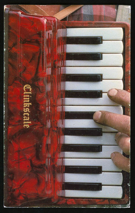
In 1977 Telfer bought a piece of land in rural Scotland called Deuchar Mill. The stone cottage on the property needed work and Telfer and his partner Helen Douglas set about designing simple, direct pieces designed for off-set printing, until the repair and construction of the Mill was complete. Clinkscale was one of these.
In most cases, full color printing was cost prohibitive for WeProductions. In the pre-photoshop era, the expense of having color separations produced professionally was substantial. For Clinkscale however, Stokes and Douglas pursued and received an Arts Council grant which allowed them to send the book to job printer in London. Clinkscale is an accordion fold book of approximately eighteen centimeters tall by twenty-eight centimeters long. When the book is closed one can see the color photographic image of Telfer’s hands shoved through the straps of a red and black plastic accordion. On the front cover the fingers of one hand are poised to play a chord and the word Clinkscale is printed in gold letters on the marbleized, glossy, pearlescent accordion body. On the back cover Telfer’s other hand can be seen resting over several buttons. The bellows of the accordion are visible and clearly compressed. As one opens the book the accordion fold reveals itself. On one side there is a lush green expanse of vibrant spring grass undulating in the wind and stretching over ten folded panels. The back side reveals a matt grey page that is the same color as the accordion’s bellows.
That is the book. It would be easy to dismiss this as a cleaver one liner: accordion with an accordion fold format. But on closer examination there is more going on. Over top of the accordion body a band of atmospheric and biographical information can be observed: the blue sky, the green of the field, the bright spring sunlight, the work shirt and threadbare work coat. When one looks closely at Telfer’s hands and nails, particularly the thumb on the back cover, one can see a criss-cross of the shallow cuts that have been stained with dirt. All of these details speak of a place and a time and a situation. They are a record of standing in a field in rural Scotland on a crisp spring day, a record of the work that Telfer's hands are performing on the Mill. These details ground the work and tie the work to a person at a moment in time. It is a record, a document.
Taken in this context there is another layer of meaning evident in Clinkscale: the idea of breath, air, anticipation, rejuvenation and renewal. As a viewer holds the book with the bellows closed the viewer sees Telfer’s fingers poised. This builds anticipation of a motion and perhaps a sound. As the book is opened the accordion inhales, the bellows expand and the rush of air stirs the spring grass. The hands are those of a workman. The workman is standing in a field with an accordion, taking a break; taking a breather. The sea of green spring grass is symbolic of rejuvenation and renewal. Perhaps it is a clue about where Telfer draws his inspiration as if he is drawing in a breath.

Just three years later, in 1980, Telfer produced the book Back To Back. The book is nineteen by thirteen centimeters, consisting of seven signatures of sixteen pages each. It has a commercial production quality, owed mostly to it’s glossy white paper, offset printing and perfect binding. The cover image is a black and white photograph of a goose with its neck turned back on itself, so it can nestle it’s beak into the feathers between its shoulder blades. The goose gazes right back at the viewer with on black eye. The back cover is a mirror image of the front.
While Clinkscale explored a solely visual narrative, Back To Back uses both images and text to explore the relation of these elements to the double spread composition. Stokes explores the codex form through the use of blank pages and solitary images to one side or the other of the center, the gutter. The book is largely black and white photographic images, with each signature representing a set of related images. The first and last page of each signature provides the place for the text which acts as a bridge to link the visual narrative from one signature to the next. The movement of the story is from the fireside kitchen stove, the inside to the outside, along the winding wind swept sheep trails into the hills above the mill, and then back down again by stream, river and finally lake.
Back To Back contains many of the characteristics one might expect from a Telfer Stokes book. Exploration of the book form: the idea of inside and outside, pictures cut in half butted against the gutter, the idea of opening and closing as in the stove door that seems to open as the reader engages and reveals the new spread with the turn of a page. Word play as exemplified by the text at the end of the first signature: “The Iron was hot and ready to strike but there were too many in the fire.” The idea of the goose turning its neck back on itself, butted (literally) against the mirror image of itself and the way it relates to the meandering and returning of the visual and written narrative.
But beyond these things Back To Back explores again, like Clinkscale, a specific place. Back to Back is about trying to keep warm inside the mill, about feeling compelled to move to the outside, about the area where Telfer Stokes lives, and walks, and creates; about exploring with no specific goal initially and about returning home and to the studio, where a book that is a reflection of the artist's daily activities can be printed.
When he was a young man and in New York for the first time, he recognized how the city and the vast expanse of America was evident in the work of the Abstract Expressionists and informed their expansive attitude toward painting. He longed to make his own way and not to do work that was derivative. He wanted to use image and text together, but he didn’t want to work in the same traditions as his father. He became fascinated with constructing things with his hands. All of these diverse creative influences came home to roost, so to speak, in his artist books. The influence of the place where he works is surely as evident in every book he designs and produces as it was in the work of the Abstract Expressionists.
Today, Helen Douglas continues to make and publish her lush artist books from Deuchar Mill, Yarrow Scotland. Stokes now concentrates on making sculptural objects in Southwold, England.


No comments:
Post a Comment